Week 04 - Project 1 : Self-Portrait (Progress & Final Outcome)
25/01/2022-27/01/2022 - Week 4
Tan Pei Yun (0345386)
Design Principle
Task 2 - Project 1
Self-Portrait Progress & Final Outcome
Lectures Notes
"Every design starts from a problem."
We should ensure that we understand and have defined the problem before
creating any design, for instance by using a problem statement. This will not
only help to build a shared understanding of the problem, but will also
provide a focus for the rest of the process.
1.What is the problem ?
2.Who is affected ?
3.When does it happen?
4.Where does it happen?
5.Why does solving it matter?
Project 1 : Self-Portrait (Progress & Final Outcome)
What is a self-portrait?
A self-portrait is like a visual representation of you .It can be like a bunch of different colours or shapes. It doesn't even have to be your own face .It could be abstract , not showing your face too.
Idea exploration & Progress
Colour Palette

|
| Figure 1.2 Colour Palette ; holographic |
- Pleasant to look at
- Creates a sense of harmony whether in artwork , photography and design
- Makes it enjoyable , Brings content forward
Experimenting

|
| Figure 2. Experimenting ; reference |
Source : from pexels , I found this flower looks attractive and decided to transform
into other colour

|
| Figure 2. Experimenting ; gradient map |
First step where choosing a set of soft colour palette in gradient map for
the flower.

|
| Figure 2. Experimenting ; curves |
Editing and adjusting the
colour into more "holographic" colour and feels in curves tool.

|
|
Figure 2. Experimenting ; gradient map Reference picture as the left side ; checking with the final colours palette |

|
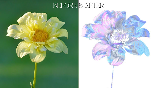
| Figure 2. Experimenting ; before and after |
Colouring with gradient map tool :
Explore and trying out in gradient map effect that I learnt from youtube. It
gives a totally new look and different feelings. The gradient map is the tonal
range of an image (flower) to the colours of a gradient fill. Tonal range
describes the image's colours , with the lightest colour (usually white) at
one end and the darkest colour (usually black) at the other end.
Progress

|
|
Figure 4. Progress , Curves ; Gradient Map Starting by using my using my own photo (reference) and editing the colour using curves and gradient map tool |

|
|
Figure 4.2 Progress , Adding Flowers Using the gaussian blur effect and putting the flowers around me |

|
|
Figure 4.3 Progress , Adding Background From the previous feedback during week 3 , Dr Charles suggest me to think about the background part and so I decided to play around with the background. |
Final Outcome - "Emotion"
|
Figure 4.5 Final Outcome of "Emotion" |
And here's the final outcome, it really meet my expectation.
Starting from the ideas, learning and understanding about my
personality, choosing the colour combination that i like and
finally it comes to me. That's me, Pei Yun. I am basically made of nothing but love, hope and wisdom, with an
ice-cold exterior that only melts for my nearest and dearest. I hate
being sensitive, I hate being able to detect the slightest change in
the way people talk or look at me.I am an overly emotional
unemotional clingy but distant private person who likes to overshare
at any moment and I'm still trying to figure it out how all that
works.
Slides
Click on the link below where I show some timelapse for the progression ! ((( PeiYun-Self-potrait-slides)))
Feedbacks
Click on the link below where I show some timelapse for the progression !
((( PeiYun-Self-potrait-slides)))
- "It works ! " ( Sir love it how it turns out )
- The portrait does not look shy but more into "mystery" feeling
- Love how the transformation
- Implied really well in Gestalt Idea in the portrait
- That one patch of pink made sir want to question . what is it about ?
- Suggest to cover the patch of pink up , or add the gaussian blur back
- Able to balance the gap
- Very interesting decision making to the portrait
- Love how it not exactly centered have a sense of mystery feeling
- The use of colours and in a nice spectrum colour
- Imagine wearing a VR headset , there's flower around , turning around and there's person watching you
- Keep going!!Nice, Very Good
Feedback from my course-mates :D
- There's a good sense of emphasis , where focus on my face very well
- Looks like an album cover !!
Reflection
"Take small steps everyday and eventually you will get there."
Honestly, I did not expect for lovely feedbacks from Dr. Charles and my
classmates , this was the very first time showing my design at class in
during degree and it just felt like received to many love at the same time ,
felt so unreal. Words can really describe how i felt but i do felt super grateful to have this project with me, it really makes
me understand about myself more and this is such a great start for me in this
2022. The project went a lot more smoother than i thought, probably is the
design thinking really works on me , the steps by steps
works.
Jumplinks
Source
Figure 1. Colour Palette ; holographic , https://www.pinterest.com/pin/817614507335753579/
Further reading


Comments
Post a Comment