Major Project - ArtGather
25/09/2024 - 18/01/2024
Week 1 - Week 15
Tan Pei Yun / 0345386
Design Portfolio /Bachelor of Design in Creative Media
Discuss about jobs in a multimedia design company that provides advertising and promotion services. Advised to focus on campaign or creative strategy design instead of just a generic designer.
Focus on creative strategy for advertising campaigns that use social media content creators as partners or Outsourced creators.
- Created user journey maps for three categories, Artists, Art Enthusiasts, and Gallery Owners. Created information architecture for the app, including specific features for artists, public users, and gallery owners. Added some features like the Gallery Management Dashboard under the profile section for gallery owners.
 |
Week 5 - Refined User Journey Map |
This week, I focused on diving deeper into understanding gallery owners and refining the app based on what I learned. Here’s a breakdown of the key things I worked on:
I gathered insights from interviews with gallery owners to better understand their specific needs and challenges. Hearing about their day-to-day struggles and priorities really helped me see things from their perspective. It gave me a clearer direction for what the app should focus on to be genuinely useful to them.
I start to analyzing features of competitor apps like Artsy, Cohart, and Iazzu. I looked at what these apps do well and which features seemed most relevant for gallery owners
After gathering feedback and doing more research, began to finalized the main app features for gallery owners, artists, and art enthusiasts. These include dashboard tools, booking systems, AR and virtual galleries, and personalized feeds. Organizing these features helped me see how everything fits together and makes the app feel cohesive.
Of course , I been keep improving the information architecture, especially for the gallery owner section. The goal is to make the app intuitive and easy for gallery owners to navigate, with tools that streamline their workflows and meet their needs effectively.
 |
| Week 5 - Moodboard for Look & Feel |
Lastly, I created a mood board to explore themes and visuals inspired by local art culture and gallery-focused elements. This helped me start shaping the look and feel of the app, ensuring it reflects the vibrant and unique art scene in Malaysia.
This Week List :
- Identifying Primary Users and Target Market
- Developed 3 Personas
- Feature Comparison with Competitors
- Verified the flowchart to confirm that all essential features and user needs are covered before moving to wireframes.
- Began creating wireframes in Figma based on gathered visual insights , however currently just wireframe as in main features
- Prepared to present art direction choices that address the primary user needs and app identity
- Slides Preparation
 |
| Week 6 - Finalised App Flow |
I started by identifying the primary users and target market for ArtGather. This step was crucial in understanding who the app is designed for, what their needs are, and how the app can serve them in the best way possible. By narrowing down the audience, I was able to focus the design process on creating something truly meaningful for the intended users. I also prepared to present art direction choices that reflect both the primary user needs and the identity of ArtGather. This included exploring color schemes, typography, and design elements that align with the app’s vision while appealing to its audience.
 | ||
| Week 6 - Competitor Analysis |
Week 6 - More App for Competitor Analysis
I conducted a feature comparison with competitors like Cohart, Artsy, and Iazzu to better understand the current market landscape. This analysis highlighted the strengths and weaknesses of these platforms and identified opportunities where ArtGather could stand out and offer a unique value proposition.
This week has been sleep less than for fews hours and been spent most of time working on the proposal presentation and got some really helpful feedback yet feel slightly overwhelmed. This was the very first time in my degree happened that I felt very lost and not sure what should I do to focus whether is my app direction is on track or not. There's so many things going on , proposal presentation and event fundraising for our FYP.
One big thing I learned was that my slides had too much detail, especially when explaining the user journey. It made things feel overwhelming and less focused. Moving forward, I’m going to keep things simpler, just focus on the key pain points and main challenges users face. I’ll also make the journey map cleaner, showing only the most important interactions.
Another point that hit home was that the app might have too many features, which could make it confusing or harder to use. Honestly, I got a bit carried away trying to include everything. So now, I’m stepping back and asking myself: what do gallery owners and artists really need? I’ll trim it down to just the essentials so the app feels clear and focused.
Mr Zeon asked what makes my app stand out, and it made me pause. I realized I hadn’t fully thought through its unique selling point. There’s a lot packed into it, but I need to figure out which feature or value truly sets it apart. This will help me focus the entire project around that one thing that solves the biggest problem for users.
Lastly, there was a suggestion to look into how many art galleries there are in Malaysia. I hadn’t considered this before, but it makes sense. Knowing more about the potential market will help me shape the app to meet the real needs of local galleries.
 |
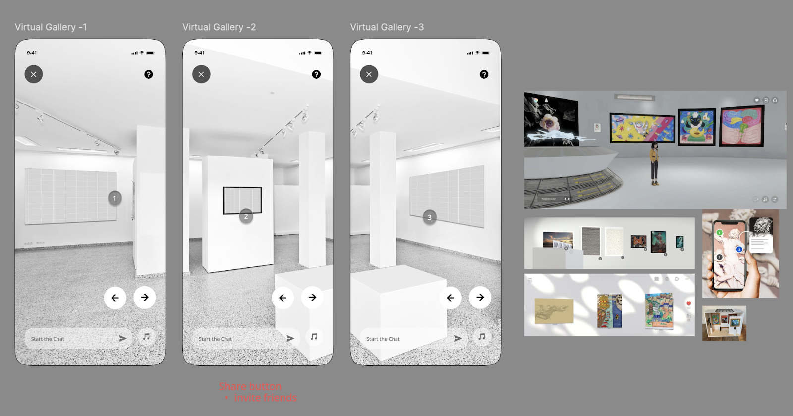
| First Draft of Virtual Gallery #1 |
 |
| Refine of Virtual Gallery #2 |
This week was tough, I understanding that functionality over novelty , at first, it seemed like an exciting and creative way to showcase the galleries. However after the feedback which realized it might not be practical in the long term. 3D isometric gallery view can attract attention, they need to serve practical, long-term user needs.That was a valuable learning moment for me sometimes, what feels exciting creatively might not serve the users effectively.
Began brainstorming more creative and visually engaging ways to present thumbnails that align with the app's overall aesthetic and user experience.
 | |
|
Guidance from Dr. Mike, clarified the app's key USP:
1. Discover and connect art enthusiasts with artists in a meaningful way.
2. Art Enthusiasts able to visualize art in your space before you buy.
3. Experience live exhibitions anytime, anywhere through live exhibitions and interactive shows for galleries.
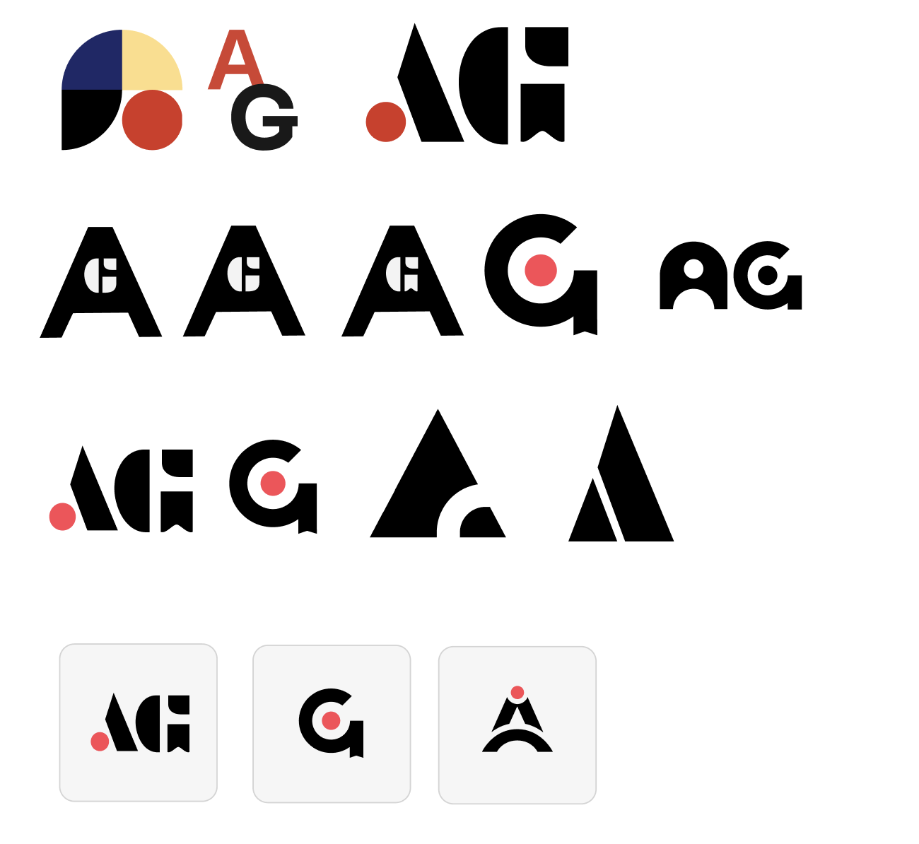
This week, I focused on creating a logo for ArtGather that symbolizes the “connection” between artists, art lovers, and gallery owners. The main objective behind this logo design was to visually represent the idea of bridging these communities while emphasizing the app's core purpose, connecting artists with art enthusiasts. The logo is not just a symbol but a representation of ArtGather’s mission
 |
| Dark Mode ArtGather App |
I began exploring dark mode as the app’s default theme. The goal was to create a visually striking interface that stands out while prioritizing readability and accessibility. I’m currently gathering inspiration and refining ideas to ensure the dark mode theme enhances the app's aesthetics without compromising on usability.
This week, I conducted user testing by sending targeted questions to an art enthusiast and an artist. Their feedback provided valuable perspectives, with most of their responses affirming that the app effectively connects artists and art enthusiasts. However, both users highlighted specific issues that need attention, which I’ve noted for improvement in the next stage of high-fidelity design.
Based on their input, I started revising the homepage to address the identified pain points and enhance the user experience. These adjustments will be crucial in aligning the app more closely with user expectations.
 | ||
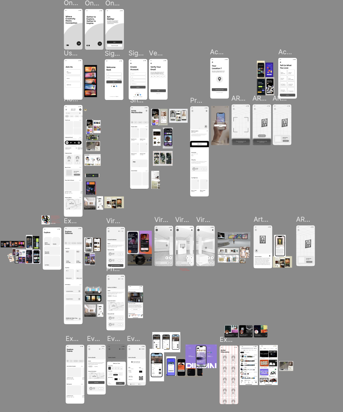
Messy Artboard OMG
|
This week, I finalized and confirmed the art direction for the app, ensuring it aligns with the app's core purpose and user needs. Additionally, I explored feature references to refine the app's functionality and user experience further.
Moving into the high-fidelity stage, I started by creating the logo animation, aiming to establish a memorable and cohesive brand identity. Alongside this, I began refining the sign-in and sign-up flow, transitioning it from low-fidelity wireframes to high-fidelity designs for a polished and intuitive user experience.
- Add up my speed to complete the high-fidelity and send the link for user testing
- I find a few more user for helping me to test it out for both wireframe and high-fi
- Start to planning for ways to promote the apps as a app campaign
- Designing the key visuals and transform them into few OOH ads , social media posting , collaterals and merch
- Start storyboarding on the 20sec video promo for the app
- Finalise and checking the high-fi prototype and begin to insert and design slide
This week, I accelerated my pace to complete the high-fidelity prototype and prepared to send out the link for user testing. I also reached out to additional users, including both artists and art enthusiasts, to gather more feedback on both the wireframe and high-fidelity versions of the app.
 |
| App Campaign Progress |
Simultaneously, I began planning promotional strategies for the app campaign, brainstorming creative ways to highlight its unique features and purpose. This included designing key visuals and translating them into various formats, such as OOH advertisements, social media posts, collaterals, and merchandise.
 |
| Editing Progress for App Campaign |
 |
| Progress in Storyboarding |
In addition, I started storyboarding for a 20-second promotional video to showcase the app in an engaging and impactful way. After finalizing the high-fidelity prototype, I thoroughly reviewed it for any final adjustments and began integrating the designs into the presentation slides for a cohesive and final app showcase.
This final year project has been one of the most challenging yet rewarding experiences I’ve ever had. When I first started, I felt completely overwhelmed. There were so many ideas swirling in my head, and I struggled to find the one that truly resonated with me. I kept second-guessing myself, constantly wondering if my project was “big enough,” “unique enough,” or even realistic. That doubt lingered for weeks, and honestly, it was exhausting.
It hasn’t been smooth sailing at all. There were countless late nights where I sat staring at my laptop, unsure of how to move forward. Sometimes, I’d get so caught up in small details that I forgot to step back and look at the bigger picture. But every time I hit a wall, I reminded myself why I started and why this project matters—not just to me, but to the people I’m designing it for.
I am incredibly thankful to all the people who supported and guided me throughout this journey with ArtGather. There were moments, especially midway through the process, when I felt so lost and unsure of the project’s purpose and goals. But with encouragement and feedback from mentors, peers, and even constructive criticism from user testing, I slowly began to find clarity and direction.
First and foremost, I want to thank Dr. Mike for guiding us UI/UX students from week one all the way to the end of the semester. In the beginning, I was super clueless, and the feedback he gave—like “think more from the user’s shoes”—would sometimes give me a headache because I didn’t fully get it. But over time, I started to understand what he really meant, and it completely changed how I approached my work.
I also want to thank Ms. Anis. I still remember one moment during a consultation for another module. I felt really lost, not knowing the purpose of my final project. I needed someone to talk to, and Ms. Anis listened. She told me, “Just think of something simple—don’t make it so hard for yourself. Maybe think of something affirming. I think artists would love that.” The way she said it was so comforting yet inspiring. Her words stayed with me and helped me refocus on my project.
Lastly, I want to thank Mr. Razif, who has taught us in several semesters. I’ve always been a bit scared to “kacau” him unless I absolutely couldn’t solve something on my own—maybe because he could be quite garang sometimes! I’d usually try to figure things out myself or even turn to ChatGPT first. But during this semester, after my proposal presentation (where I felt super lost and couldn’t even answer Mr. Zeon’s questions), I received a message from Mr. Razif: “Do you need help?” I almost cried when I saw it. He offered guidance and helped a few of us understand how to improve. Through his advice, I learned about the business model aspect of the app, which is something I hadn’t thought much about before. That conversation helped me so much in planning and refining my project.
This journey has been a rollercoaster, but it taught me resilience, patience, and how to seek support when I need it. To everyone who helped me along the way, thank you from the bottom of my heart.


Comments
Post a Comment