Application Design 1 - Final Task - High Fidelity Prototype : GongCha Mobile Application
07/04/2023 - 0/0/2023
Week 1-Week 14
Tan Pei Yun / 0345386
Application Design 1 /Bachelor of Design in Creative Media
Final Task - Hight Fidelity Prototype : GongCha Mobile Application
Task 3 - Customise Taro Milk Tea
#4 User : Zhen Riq
Week 1-Week 14
Tan Pei Yun / 0345386
Application Design 1 /Bachelor of Design in Creative Media
Final Task - Hight Fidelity Prototype : GongCha Mobile Application
Jumplinks
Instructions
Final Task: High Fidelity Prototype
//Progress
.jpg) |
| Overall Progress Screen Grab In Figma |
Creating the high-fidelity prototype was a bit challenging because I had to be really careful about the small details, like colors, icons, and shapes. It was important to make everything look consistent that able to match Gongcha's brand together that relates to a bubble tea store style. Finding the right product images also took some time too, as I wanted them to fit well with the app's theme.But overall, it was rewarding to see the prototype come together and matches together I learned how important it is to pay attention to every little thing to make the appealing and user friendly
Used Layout grid in Figma
One thing I noticed and find it useful is that where I used layout grid to help me to maintain consistency across different page of the GongCha and ensuring that elements align perfectly from one screen to another.
Refine / Improvement
 | ||
Improvement under on-boarding
|
During the refinement and enhancement process from the low-fidelity to the high-fidelity prototype, I made significant improvements to the onboarding section. One noticeable change was replacing the "skip" option with a more engaging "next" button. This small tweak was aimed at encouraging users to explore the onboarding process and discover the features of the Gongcha app. Moreover, I selected attractive and relevant photos to accompany the onboarding screens, where I think that visuals play a crucial role in capturing users' attention and conveying the essence of the app.
 |
| Improvement in sign-up page |
In the sign-up page, I focused on ensuring consistency in the shape and color of the icons to complement the overall design and layout of the Gongcha app. This decision was influenced by valuable feedback gathered during the usability test. With a consistent design, users can easily understand and recognize different actions. It creates a better user experience and strengthens Gongcha's brand identity throughout the app.
In the store location section, some users provided feedback during the high-fidelity prototype testing that they found it slightly challenging to distinguish the colours for "find a store" and "pick-up" options. To address this, I made enhancements by adding a subtle shadow effect to make the shapes stand out more and added icons to provide clear visual cues for each option. This improvement makes it easier for users to identify and select their preferred choice, enhancing the overall usability of the GongCha app
In the reward page, I made significant design changes based on user feedback. Users suggested using a "member card" design, which I implemented. The new design includes attractive illustrations and colors, making the rewards page more visually appealing. By incorporating the member card concept, users can now easily track their rewards and enjoy a more engaging experience while redeeming their benefits. This change was well-received during the high-fidelity prototype testing and contributes to an improved user interface for the Gongcha app.
Category / Menu page
This part is the most satisfied yet challenging part, where need to spend lots of time finding the GongCha drink images and turn it the PNG all by myself, the satisfied part will be after everything is done, get to see the overall outcome turns out.
Most of the picture and photos are got it from the original GongCha website :
In the process of refining the high-fidelity prototype, where is necessary to paid close attention to maintaining consistency in the design elements. It is to make sure that all category labels, and images had uniform borders, corners, and shapes throughout the app. This consistency helps create a cohesive and new polished look for the GongCha app and hope that it can enhancing the overall user experience.
Icons / Navigations
After getting feedback from users during the usability testing which was recommended using different colours to make clickable items stand out more. With that, I have made the changes and used maroon red and black colours that able to made the icons more noticeable and easy to interact with.
Usability Testing
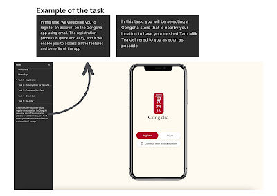
 |
| Task Given during the usability test |
Task given :
Task 1 - Registration
In this task, user need to register an account on the Gongcha app using email. The registration process is quick and easy, and it will enable to access all the features and benefits of the app
Task 2 - Delivery Order for Gongcha milk tea
In this task, user will be selecting a Gongcha store that is nearby your location to have your desired Taro Milk Tea delivered to you as soon as possible
Task 3 - Customise Taro Milk Tea
In this task, user will have the opportunity to customise your own Taro Milk Tea drink using the Gongcha app. Personalise your drink according to your preferences.
Task 4 - Customise Taro Milk Tea
Check Out Your Order. Proceed to the 'Order Summary' section and Click 'Order Nowt' to make the payment. And You're done ! Taro Milk Tea is on your way !
Task 5 - Re-order
Re-Order Favourite Taro Milk Tea. Head to your profile page and find the 'Order History' section. Look for the 'Re-Order' button next to the previous Taro Milk Tea order and simply click to get your craving fix
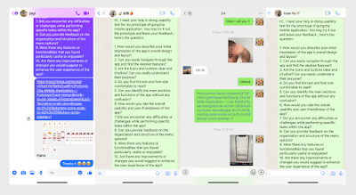
Moreover , I also let my friend Siew Weng and also family members to try out the app , where you can see their reaction :
Usability Test from User : Siew Weng
Usability Test from Users : Ivy (Mom) & Thomas (Brother)
Before letting them try the app, I made sure to explain the scenario and task they had to complete. This way, they understood what to do and what to order. However, I noticed some age differences when my mom and brother tried the GongCha app. My mom found it a bit difficult to click certain buttons, as she is not as familiar with technology as my brother.
User Feedback
Overall user feedback from previous 5 participants from low-fi usability test
This is where I let the 5 participants from previous low-fi usability test and try it out the final high fidelity prototype, the overall feedback given which is in a good feedback and positive reactions. I made a slightly changes where added a few animation to enhance overall user experience when using GongCha app. And also enhance some font size and the icon size. Once is done and check everything where is time to submit !
#1 User : Xin Rou
Communicate through Whatsapp - text message
Overall feedback : It looks different now and love the picture of the onboarding it really matches the Gongcha App , design is minimalist yet able to understand the overall flow
#2 User : Yeh Cherng
Communicate through Whatsapp - video call
Overall feedback : My first impression of the app's design and layout is pretty good. It looks neat and organized, which is appealing to me
#3 User : Siew Weng
Communicate through physical in campus
Overall feedback : Is cleaner and looks nice with added pictures and colours now , the colour of red, white and beige suite the app
#4 User : Zhen Riq
Communicate through physical
Overall feedback : App overall design and layout is impressive. It looks modern and visually appealing, catching my attention right away.
#5 User : Jia Yi
Communicate through messenger text message
Overall feedback : I can see that the reward page has change and looks nice with the new design and layout ,overall the app is nice
#6 User : Ivy (Mom)
Communicate through physically at home
Overall feedback : I able to manage do all the task but my taro milk tea haven't arrive ? (sorry, this is just joking)
#7 User : Thomas (Brother)
Communicate through physically at home
Overall feedback : The colour combination is interesting and suprisngly suit the app, overall is easy to navigate and understand the flow of the app.
.gif) |
| Update : Animation of the logo |
.gif) |
| A comparison with the original GongCha mobile app with the re-design version |
Final Prototype - GongCha Mobile Application
 |
| Final High Fidelity Prototype : GongCha Mobile Application |
| Final High Fidelity Prototype : GongCha Mobile Application |
Final Prototype GongCha Mobile Application Showcase
Final Prototype GongCha Mobile Application
Final Prototype GongCha Mobile Application : QR Code & Link
Reflection
Reaching the end of Application Design 1 has been a half enjoy yet challenging journey. As this task are mostly have to really paid attention to every single small detail (buttons, shape, colour, font size and more) Of course, I do realised the true significance of design and its impact on the user experience too. The process of creating this app from scratch has been time-consuming, but it has been worth every effort, where good thing is where Mr Shamsul allow us to use plug in and from community to make the task easier. From the initial wireframes to the high-fidelity prototype, I encountered few obstacles that pushed me to think critically and find some other creative solutions. Every decision I made, from choosing the colour palette to refining the icons, played a vital role in shaping the overall user interface. Each element needed to align with GongCha's brand identity while ensuring that users can effortlessly interact with the app. This will be the very first time,where I redesign a app from 0% to 100% all by own, I know some details might not be the best, but I glad that I managed to do it all by my own and also with the helps from user feedback and suggestion , glad that people would help me and push my to the end, thank you everyone ! (if you are stalking / watching me :3)


.gif)


.jpg)


.jpg)


Comments
Post a Comment