Application Design 1 - Task 3 : Low Fidelity Prototype : GongCha Mobile Application

Week 1-Week 14
Tan Pei Yun / 0345386
Application Design 1 /Bachelor of Design in Creative Media
Task 3 : Low-Fidelity Prototype : GongCha Mobile Application
Jumplinks
EXERCISES - Application Design Exercises
Instructions
Task 3 : Low Fidelity Prototype
//Progress
WireFrame

|
|
Wireframe Progress |
Before diving into the low-fi design, I decided to start with
wireframing. This decision allowed me to plan and organize the app's
layout and features in a simple and basic way. It was like creating a
blueprint before building a house. I gained a clearer understanding of the app's structure and flow. It
helped me stay focused on the core functionalities and user
experience, ensuring that the app's foundation was solid and
user-friendly.
Final GongCha Mobile App Wireframe in Figma
Visual Design Concept
On-boarding

|
| On-boarding page |
Referring back to the key principle of usability, where I will be
consider about the simplicity to make the app user-friendly, I kept things simple and clear. During onboarding, I designed scenes with important words and images at the centered to catch user attention. This way, it can easily follow the app's flow and find what user need without any confusion.
Registration

|
|
|
For the sign-up page, I got inspired by the GongCha logo and placed it in the middle. I found a great idea from the Figma community, which helped me understand how to create a formal and clear sign-up page.
Home & Menu Page

| Home & Menu Page |
The home and menu pages were the areas where I dedicated most of my time during the design process. The home page is crucial as it plays a significant role in the app's overall experience. On the other hand, creating the menu page was a bit challenging, as I wanted it to be straightforward yet clear for users to navigate easily.
Customise Drink

| Customise Drink |
The customise drink part is one of my favorite designs in the app. I put a lot of thought into making it visually appealing and user-friendly. The buttons, designed in a round shape, are meant to symbolize boba, giving the interface a playful touch that aligns perfectly with the bubble tea theme.
Profile

|
|
Profile Page |
The profile page was a bit uncertain for me at first, so I took inspiration from other apps and tried to incorporate the best ideas while keeping it simple and user-friendly. I observed how other apps organized their profile sections and used that as a starting point. I wanted to avoid cluttering the page with too many buttons or options, so I focused on essential features and made them easily accessible. By taking a minimalist approach, I aimed to create a clean layout that users can navigate effortlessly.
Rewards

|
| Reward Page |
The reward page was a fun and exciting part of the design process. I wanted to make it visually appealing and engaging for users. Drawing inspiration from real-life coupons and vouchers, I decided to use ticket and voucher shapes to symbolise the rewards and discounts available to users.
Check Out

|
| Check out process |
When designing the checkout process, I looked for ideas and inspiration from other in the Figma community. I wanted to make sure that the checkout experience was easy for users to follow and complete their orders.
Colour Theme

| Colour Theme |
For the brand colours, I decided to use the red colour from the GongCha logo as the primary colour throughout the app. This helps to create a strong and recognisable brand identity. I used shades of red for buttons, highlights, and important elements to make them stand out.
To ensure readability and maintain a clean design, I incorporated shades of grey and black for text and other elements that required a more subtle appearance. This creates a good contrast with the red elements and makes the text easy to read. In the low-fidelity prototype, I kept the colour palette simple and limited to focus more on the layout and functionality of the app. As I move forward with the design, I will further refine and enhance the colour scheme to create a cohesive and visually appealing user interface.

| Typography |
Why Choose Work Sans ? Based on my research where Work Sans have a clean and modern font that offers nice readability on digital screens. Its simple and well-balanced letterforms make it easy for users to read the app's content without any visual strain and I think that using Work Sans is a versatile font that able to works well for both headings and body text. By using Work Sans in the app, I maintain consistency with GongCha's branding across all touchpoints.
Icons

| Icons Selected |
The icons were used in the plugin of Iconify, where it has simple and understandable design, I choose that are in fill design icons rather than using stroke icon
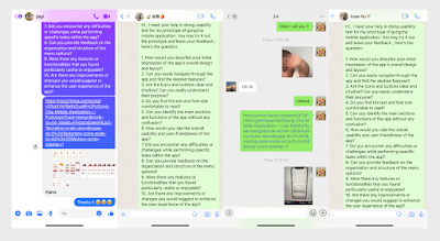
Usability Testing
I conducted 5 different participants for usability through
online and physical (text messages , online video call ) , I
collected the data with asking total of 10 questions and also
recorded some clips of the reaction while using the application.
Below are the 5 user and each of their overall
feedback.

Task given :
Task 1 - Registration
In this task, we would like you to register an account on the Gongcha app using email. The registration process is quick and easy, and it will enable you to access all the features and benefits of the app
Task 2 - Delivery Order for Gongcha milk tea
In this task, you will be selecting a Gongcha store that is nearby your location to have your desired Taro Milk Tea delivered to you as soon as possible
Task 3 - Customise Taro Milk Tea
In this task, you will have the opportunity to customise your own Taro Milk Tea drink using the Gongcha app. Personalise your drink according to your preferences.
Task 4 - Customise Taro Milk Tea
Check Out Your Order. Proceed to the 'Order Summary' section and Click 'Order Nowt' to make your payment. And You're done ! Taro Milk Tea is on your way !
Task 5 - Re-order
Re-Order Your Favourite Taro Milk Tea. Head to your profile page and find the 'Order History' section. Look for the 'Re-Order' button next to your previous Taro Milk Tea order and simply click to get your craving fix
Usability Test from Siew Weng
User Feedback
Compilation of 5 user feedback
|
| Usability Test through online |
#1 User : Xin Rou
Communicate through Whatsapp - text message
Overall feedback : Simple and straightforward , easy able to
understand . Improvement can be enhance the description of each drink in
the menu
#2 User : Yeh Cherng
Communicate through Whatsapp - video call
Overall feedback : Nope I think is good enough
#3 User : Siew Weng
Communicate through physical in campus
Overall feedback : As currently is still in the low fidelity
stage , it may hard to imagine without picture and description
, but overall the menu and icons are clear and able to
understand of the application
#4 User : Zhen Riq
Communicate through physical
Overall feedback : One improvement I would suggest is to have a search bar for the menu. It would make finding specific drinks quicker, especially when the list grows.
#5 User : Jia Yi
Communicate through meesenger text message
Overall feedback : Easy to understand how’s is the app
work without confusion can’t wait for the final
prototype looks like. Only improvement is to enhance the
reward page.
Areas for improvement
Identify application design issues
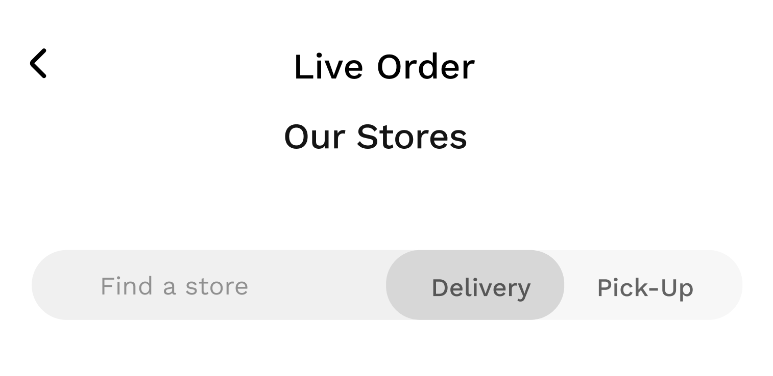
After conducting usability tests with five different users, I was able to identify some minor flaws in the low-fidelity prototype. For example, on the Gongcha listing page, I noticed that the "ASAP" icon wasn't very clear, and the text color was too light. The same issue was present on the locator page, where users found it slightly confusing to switch between delivery and pick-up options. These insights from the tests will help me make necessary improvements to enhance the user experience.
 |
| ASAP icon & text |
Based on user feedback :
- No images which lead to confusion and no direction of the app when during the usability test
- Inconsistent design in the round shape (can be improve it )
- Description need to be enhance and detailed
- Text and colour / shade
- Search Bar can be added under menu page
 |
| No image icon was add inside menu page |
 |
| Inconsistent shape & design |
 | |
|
 | |
|
With the feedback given from the participants, I able to refine it
during my high fidelity prototype stage which will be document it the
progress in Final Task - High Fidelity Prototype : GongCha Mobile
Application
Final Task 3 : Low Fidelity Prototype
Final GongCha Low Fidelity Prototype Overview
Final Low Fidelity Prototype : GongCha Mobile Application
Final Low Fidelity Prototype : GongCha Mobile Application QR Code & Link
Reflection
During the process of creating the low-fi prototype for my Gongcha bubble tea application, I gained a deeper appreciation for the path or world of UI/UX design. It became clear to me that this field is not just about putting together pretty visuals but it involves ALOT of specific steps and adhering to essential principles to ensure a seamless user experience. Designing the interface was not as straightforward as I initially thought. I had to constantly put myself in the shoes of the users and consider their perspective at every stage. Each decision I made, from the placement of buttons to the choice of colours and fonts, had to be purposeful and intuitive for the users. Moreover, the iterative nature of UI/UX design meant that I had to continuously gather feedback and make necessary adjustments to improve the prototype. It wasn't about getting everything perfect from the start but rather learning and evolving the design based on user insights.
Through this experience, I realized that UI/UX design is a collaborative and challenging process. It requires ALOT of empathy, creativity, and an understanding of the psychology behind user interactions.


Comments
Post a Comment